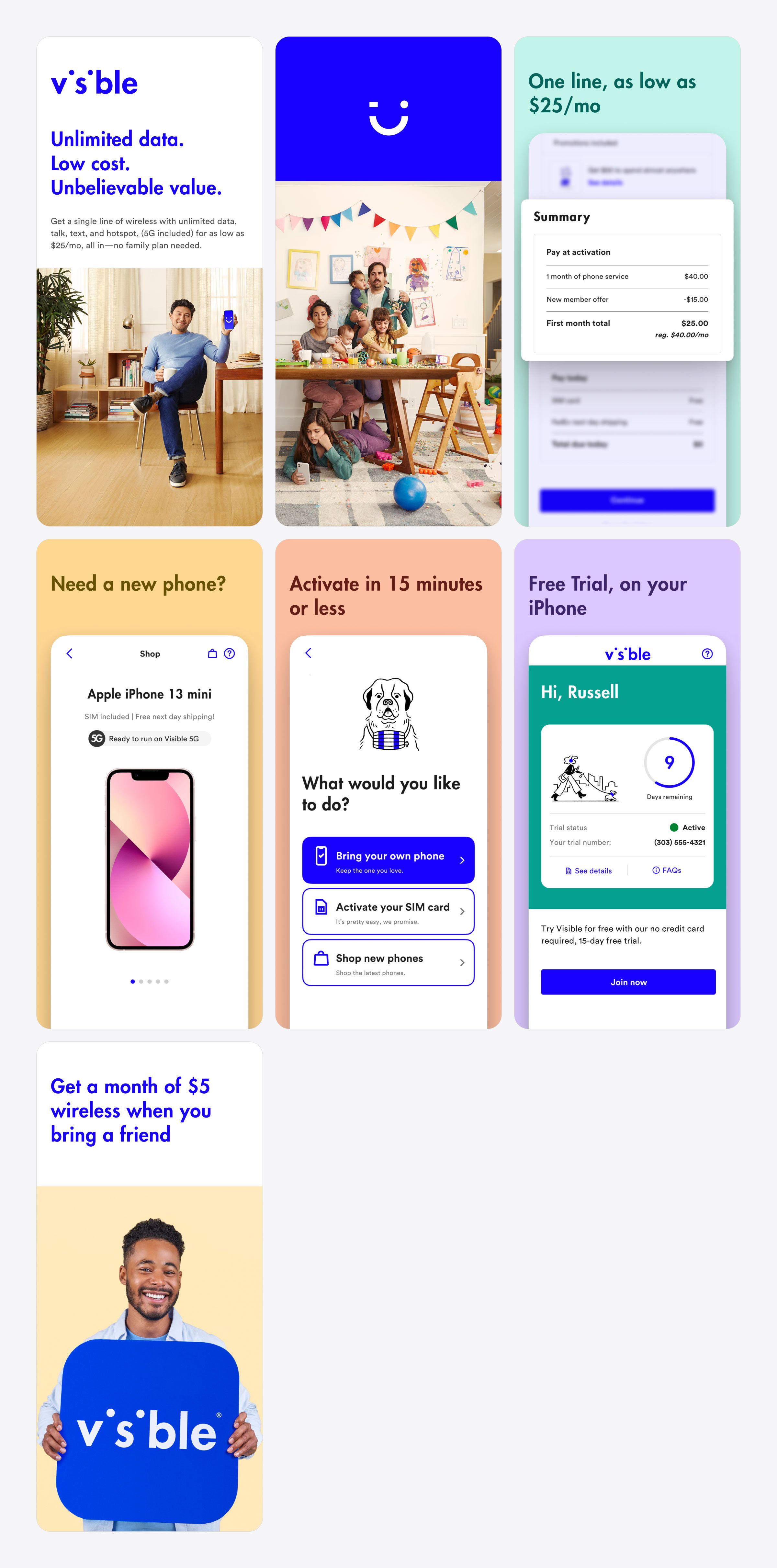
Visible for the App Store
Refreshing Visible’s App Store presence through a more cohesive icon, preview system, and on-device presentation.
Overview
As the app became a more important brand and acquisition touchpoint, Visible’s presence in the App Store needed to feel more intentional, recognizable, and aligned with the broader product experience.
Challenge
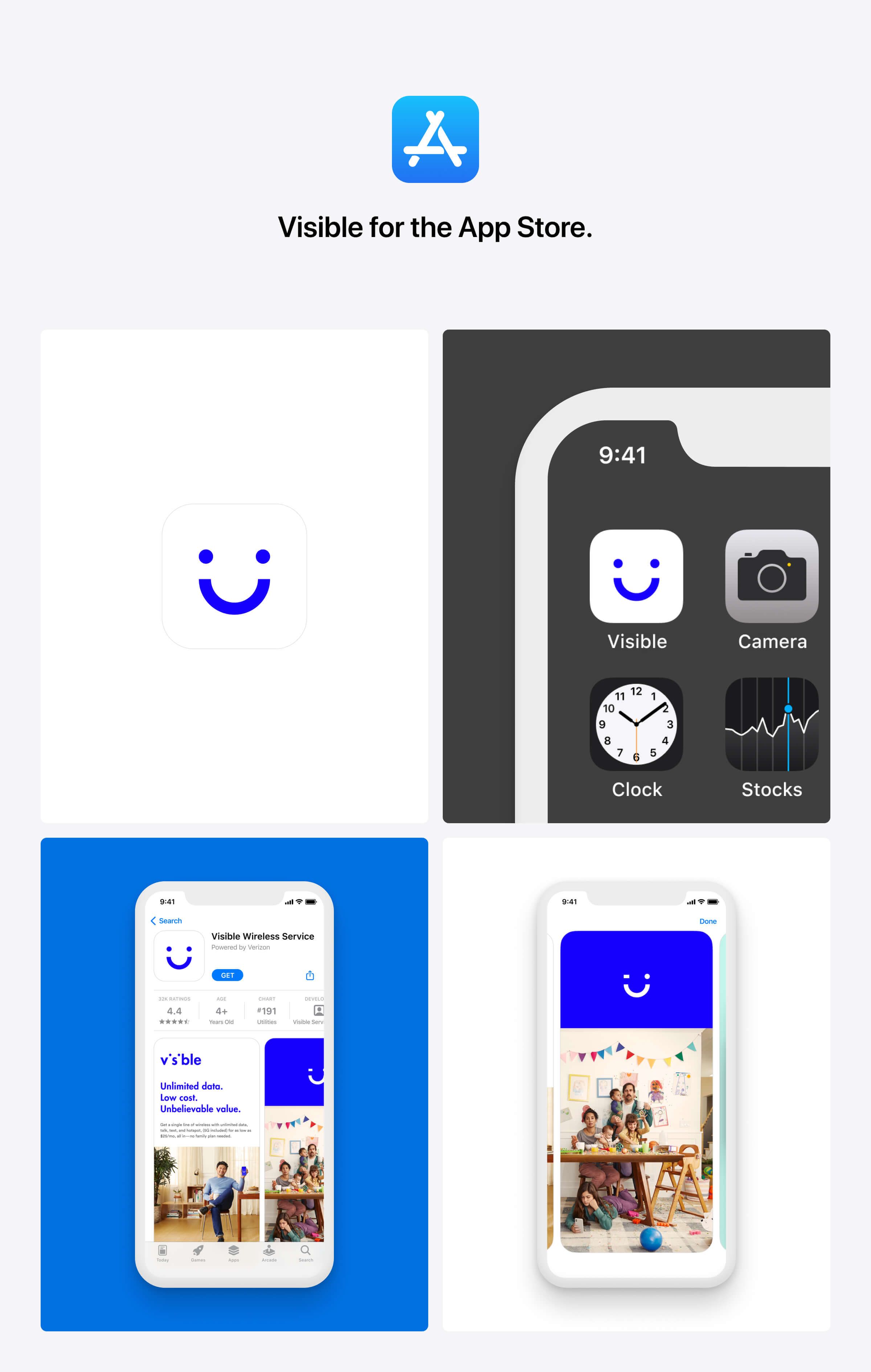
The storefront had to communicate the brand more clearly at a glance while working within the constraints of Apple’s ecosystem. It needed to feel polished and consistent, while still showcasing the product in a way that felt native to iOS.
Outcome
I designed a new app icon, created brand-aligned preview screens, and built a realistic prototype of the iOS 15 App Store experience to evaluate the work in context. Designing the experience as it would actually appear on device helped improve creative decisions and sharpen the final presentation. The result was a more refined storefront that better reflected the brand and elevated Visible’s presence in the App Store.